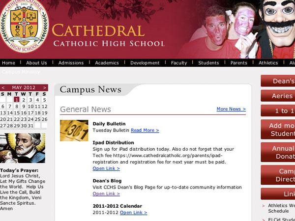
CCHS experienced a big and technical change. The main school website has been replaced as of last night, April 30th, to suit the students, parents, and faculty all the better.
Mr. Sean Doyle, director of technology, was one of the main people who had a say in changing the website. He, the administration, and communications director Ms. Marissa Pansoy have been working on the website for the past two years.
“We are trying to get a new look. It isn’t completely done, but it now has easy and quick links for users.” said Mr. Doyle.
On the very right side of the page, students and parents have access to a variety of links that were previously harder to find. Students may add money to their student cards in order to buy lunch, log into Aeries, access directions to the actual campus, or even contribute annual fund donations.
The previous website did not have problems before but was harder to access, according to Mr. Doyle.
“The site is meant to be aesthetically pleasant, and we had to collect all of the information in order to put it together. It will be primarily based on photos and visuals, so as to look better.”
The new website has a constant picture slideshow in the right corner and has a slightly different color makeup. Teachers were never formally warned about the change and will eventually discover the recent switch.
As for other CCHS websites, such as Moodle, Coach Doyle says there is yet to be a change. CCHS may want to change the look of the site so that it uses more school colors and looks as if it is a Cathedral website.
Moodle is an online forum for students to post for various classes. The students write blog type entries and may comment on each other’s entries depending on the class. CCHS is trying to integrate online forums such as moodle more and more into the curriculum, especially since the recent adoption of one on one iPad learning.
“We may change the look of Moodle, but haven’t decided. The change, like that of the website, would be purely visual.”
Here’s the link to the new site: CCHS News
















Carolina • May 4, 2012 at 1:39 PM
I really like the new layout for our school website. I think it’s good to change it up every once in a whilee, and it’s good that they put pictures of students up. I recommend they change the pictures maybe twice a week! 🙂
Samantha • May 1, 2012 at 8:19 PM
I think a change to Moodle would be completely helpful. When you first enter the site, you swear it’s not a Cathedral site, and it doesn’t seem to belong. Also, it is a little tricky to navigate.